Serpents, Wings and a Crown: A Closer Look at the Eyehategod Serpents Designs
Two serpents wind up a staff. A crown sits at the top, a pair of worn wings spreads out on either side, and heavy lettering spells out EYEHATEGOD across the top. Of all the artwork in the Eyehategod collection, the Serpents pieces are some of the most detailed, and they come in two versions that are easy to mix up. Here is what each one shows, which garments carry it, and who each piece suits best.
What does the Serpents design show?
Both versions are back designs, so the artwork sits large across the shoulders and back rather than on the chest. From top to bottom you get:
- The band name in heavy, rough-edged lettering, running the full width.
- Two serpents coiled around a staff, crowned at the top.
- Two worn, ragged wings, one on each side, framing the staff.
- IX, set into the emblem.
- "est." with Roman numerals, the way an old crest or seal would carry a founding date.
That last detail suits a band with real history behind it. Eyehategod was founded in New Orleans on April 20, 1988, by guitarist Jimmy Bower and drummer Joey LaCaze, and it is widely regarded as one of the pioneers of sludge metal. Look closely at the IX, too: the same two letters sit in the middle of vocalist Mike IX Williams' name.
The overall effect is less like a band logo and more like an emblem you might find on an old flag or a worn coat of arms. It reads from across a room, and it rewards a second look up close.
Serpents and Wings or Serpents and Olive Branches?
The two versions share the same layout, so the difference is in the details.
Serpents and Wings has heavy green lettering and a deeper, darker green throughout. It is the moodier of the pair, closer to the swampy, soot-dark feel of the band's sound: slow, heavy, fuzzed-out riffs and harsh vocals.
Serpents and Olive Branches switches to a lighter mint green and adds a flourish and olive leaves around the staff. The extra leaves soften the crest and make the whole piece look a touch more ornate.
If you want the heavier, plainer emblem, go for Serpents and Wings. If you like a bit more decoration and a brighter green, Serpents and Olive Branches is the one.
Which garment should you pick?
Serpents and Olive Branches has the widest range, covering adult, youth and kids' pieces:
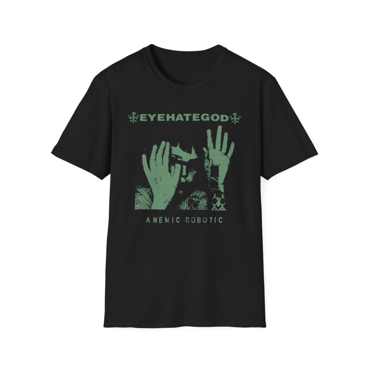
- Tee: the Serpents and Olive Branches Softstyle T-shirt is the everyday option, and a back design like this one looks great when you turn around at a show.
- Long sleeve: the Ultra Cotton long sleeve tee carries the same back design for cooler evenings.
- Crewneck: the Heavy Blend crewneck is the clean, warm middle ground.
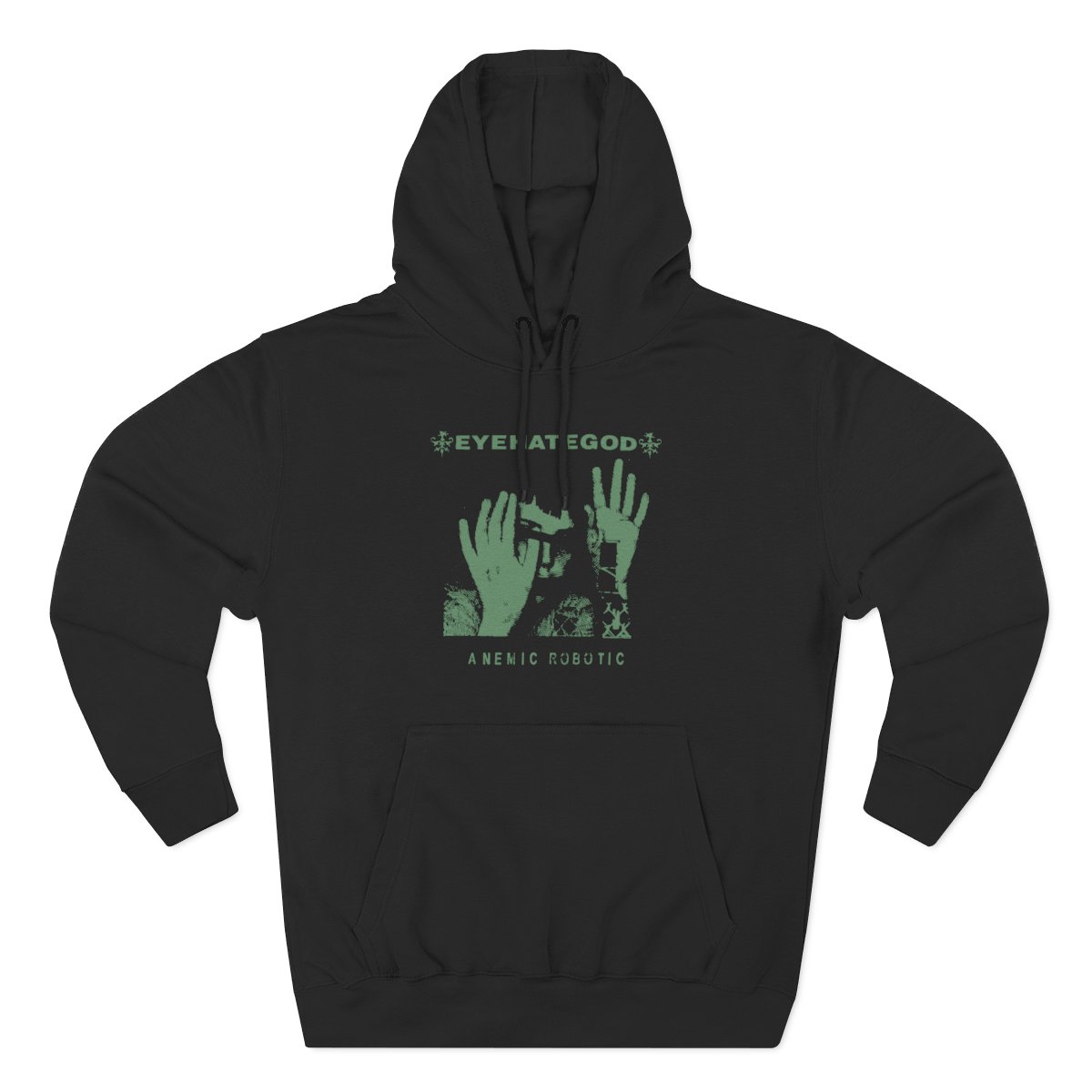
- Hoodie: the Serpents and Olive Branches three-panel fleece hoodie is the cold-weather pick, and the big back design has plenty of room to breathe on it.
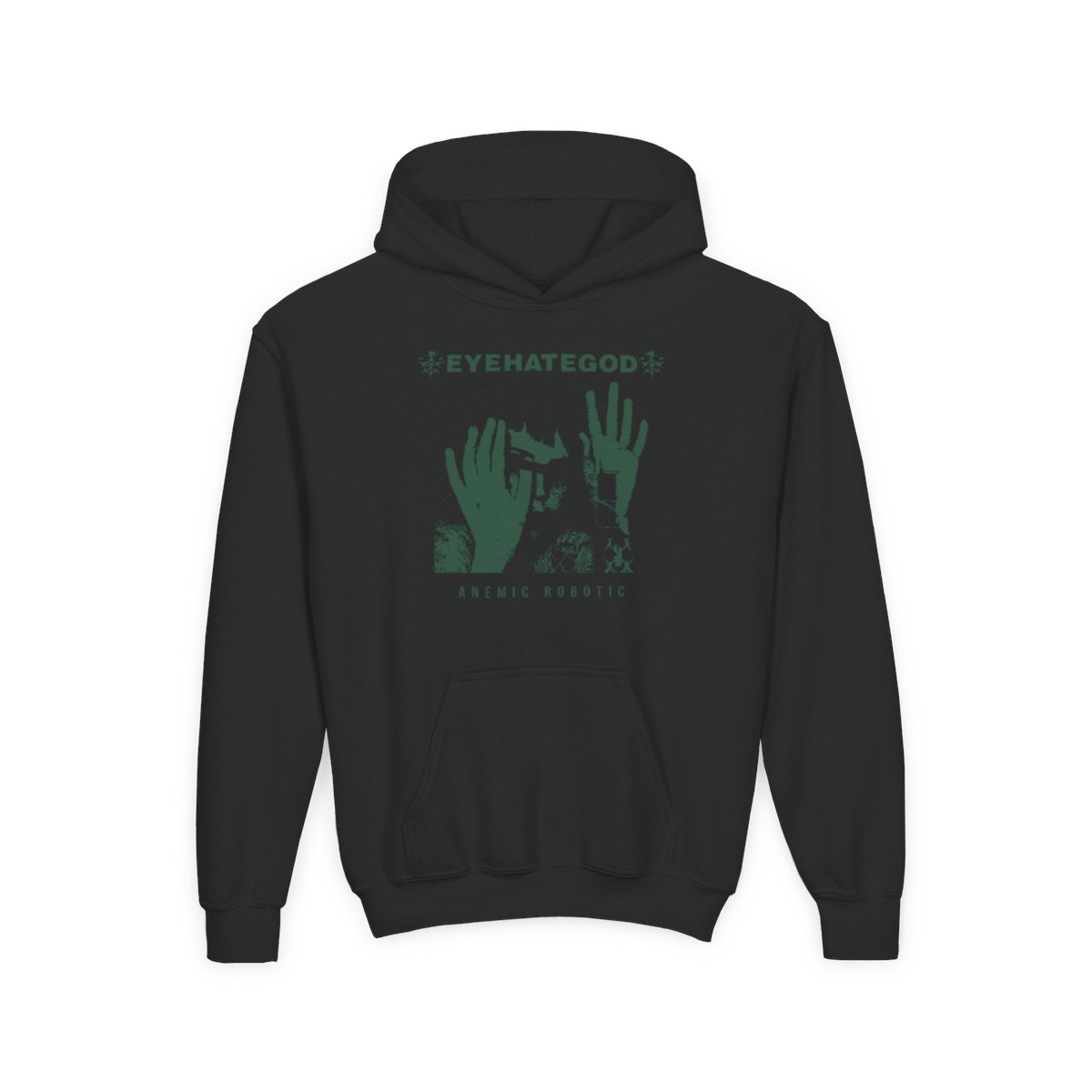
For younger listeners, both versions come on a youth crewneck, a youth heavy blend hoodie and a kids heavy cotton tee, so a whole household can wear the same crest.
All the adult garments are unisex, and every product page has its own size chart, so it is worth checking measurements before you choose a size.
Who would love it as a gift?
Winter is gift season, and the Serpents pieces make an easy present for a few kinds of people.
The one who has been listening for decades. Someone who remembers Take as Needed for Pain (1993) or Dopesick (1996) when they were new will appreciate a design built like a crest with a founding date on it.
The one who prefers art over a big logo. Not everyone wants a band name across the chest. The Serpents designs keep the name on the back and let the emblem do the talking.
The younger listener. The Serpents and Olive Branches youth hoodie gives a kid or teenager the same artwork as the adult pieces, in a warm hoodie that will see a lot of wear through the colder months.
The one who just discovered the band. Someone who came in through A History of Nomadic Behavior (2021), with songs like "High Risk Trigger" and "Circle of Nerves", gets a piece that looks right at home beside the newer records and the old ones alike.
How does it fit with the rest of the collection?
Crowns, flourishes and seals turn up again and again across the Eyehategod designs, which makes the Serpents pieces easy to pair with others. A few that sit well alongside them:
- Amps Speak Louder Than Words: an E.H.G seal with a crown, IX and New Orleans on the front, and a row of amp knobs on the back. Another crest-style piece, in black.
- EHG Blackletter Cross: three blackletter E H G boxes above a hooded, skull-faced figure with candles, also marked "est." with Roman numerals.
- Dopesick: named after the band's 1996 album, with a figure between four circular sigils under the Eyehategod banner.
- Stacked Wordmark: EYE, HATE, GOD stacked in white letters cut from a rough red block, for when you do want the name front and centre.
Mix one of those with a Serpents back design and you have a small rotation that covers the emblem side and the louder, name-first side of the collection.
The short version
Pick Serpents and Wings for the darker, heavier crest and Serpents and Olive Branches for the lighter green with leaves. Choose a tee or long sleeve for shows, a crewneck or hoodie for winter, and the youth and kids' pieces for the younger ones at home. Either way, you get one of the most detailed pieces of Eyehategod artwork, worn where it shows best: across your back.